Paige
The Last Food Fight’s vision is a world where every single person is in control of their eating habits and has the ability to determine how and when they want to eat without relying on “white knuckle” effort. I worked with owner, Yoav, to design Paige, the missing link in every behavioural coaching program. The Paige app is designed to be a trusted aid, in helping users navigate food-related situations and struggles.
Goal
Design the user experience and user interface for Paige based on The Last Food Fight’s vision.
Role
User Experience Designer, User Interface Designer
Tools
Figma
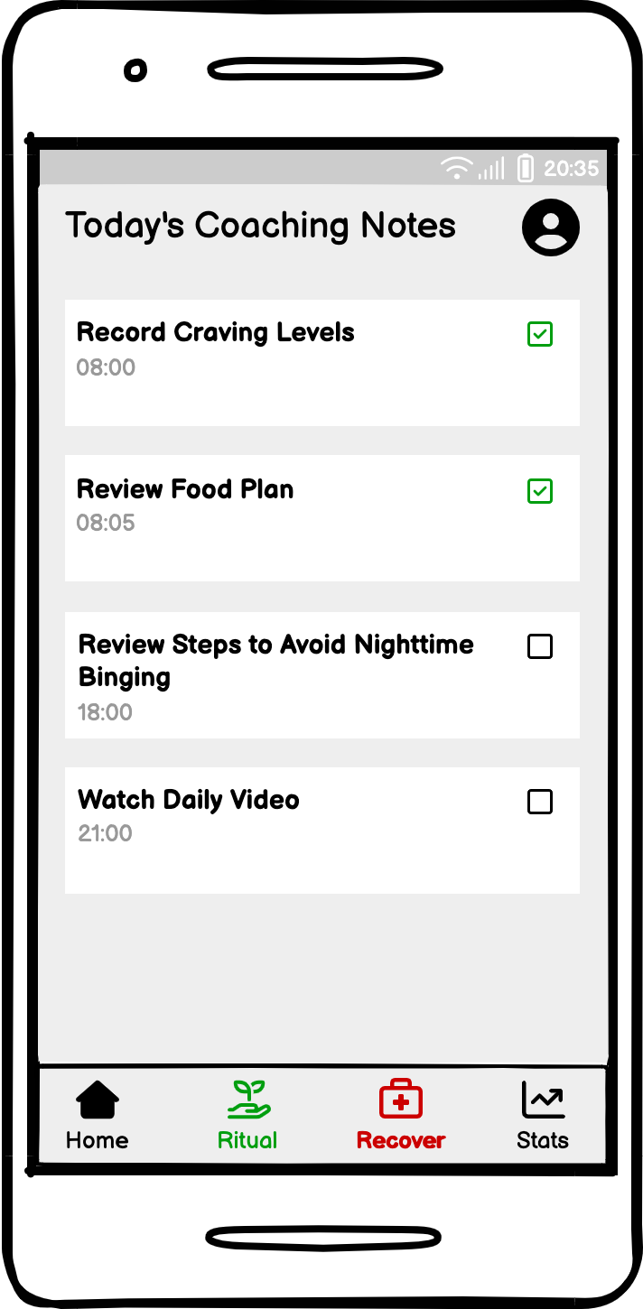
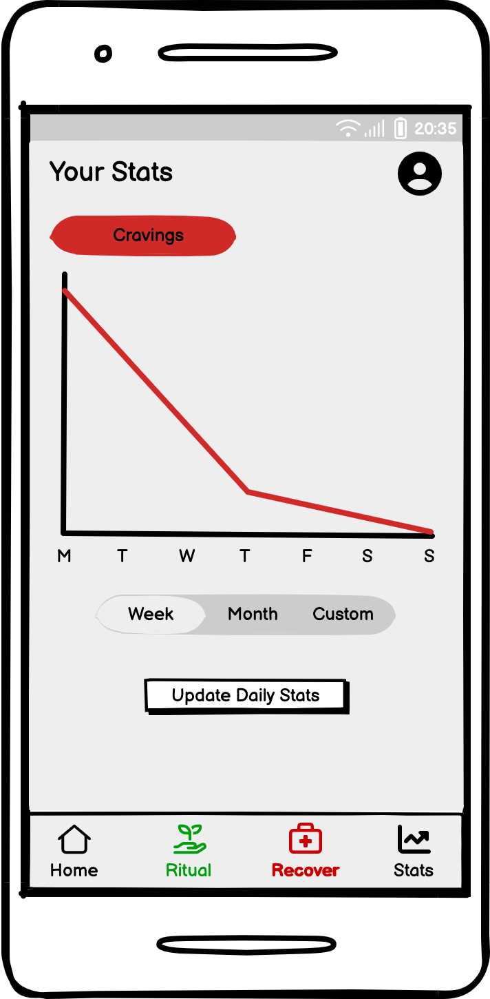
During the ideation phase, I immersed myself in a whirlwind of creativity and strategic thinking. I began by diving into user research, gathering insights to understand what users truly need and expect from the app. With this knowledge in hand, I sketched out wireframes and prototypes, experimenting with different layouts and features. I explored various design concepts, always keeping user experience at the forefront of my mind. Through iterative brainstorming sessions and design revisions, I aimed to craft an intuitive and visually appealing interface. My goal was to ensure that Paige would not only meet user needs but also provide a delightful and engaging experience.
Ideation
Home Page
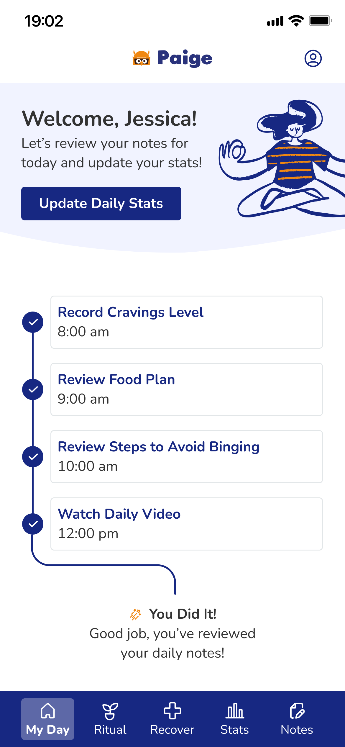
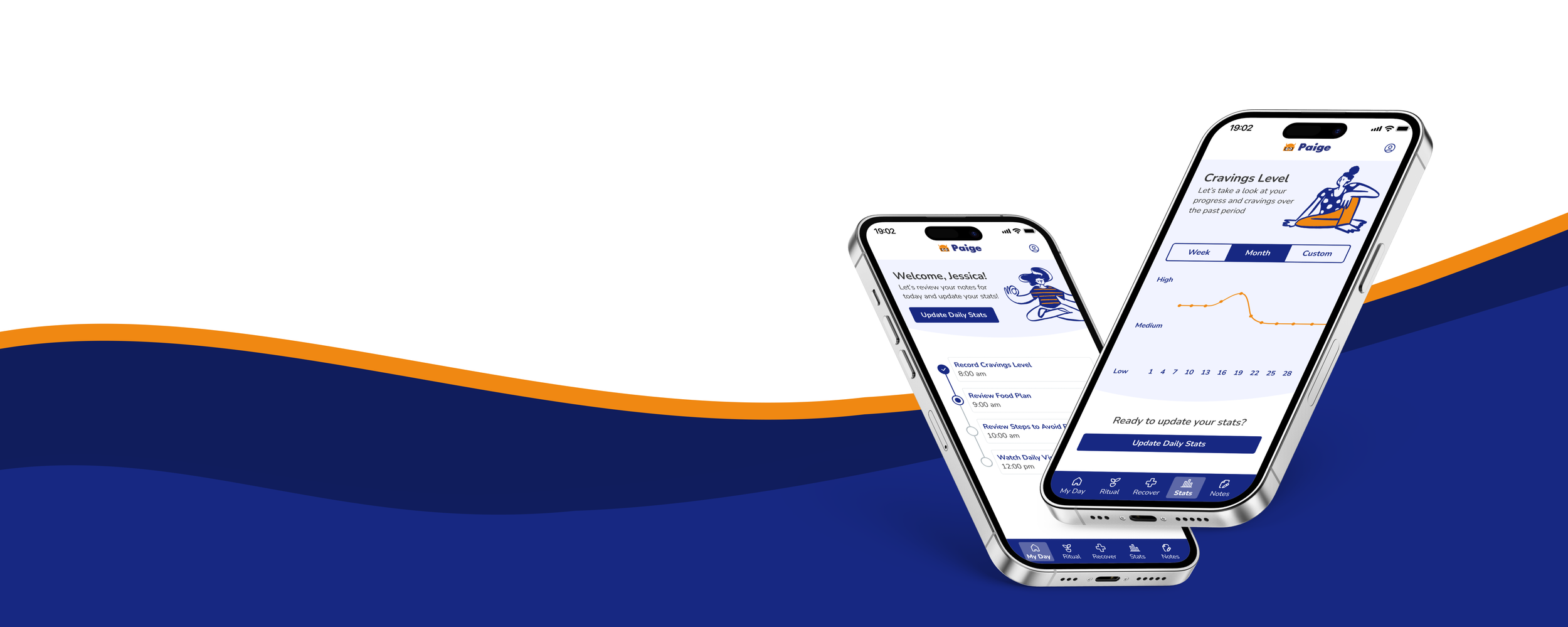
Paige's home page offers a streamlined and intuitive experience for managing daily food habits. The page features a central dashboard that guides users through their daily journey with actionable steps, designed to support effective food management. Paige's home page combines functionality with user-friendly design, making it easier to build and maintain healthy food habits while enjoying a personalized and engaging experience.
Notes and Sequences
The Notes and Sequences pages in Paige provide users with a comprehensive overview of personalized guidance from their coaches. The notes page offers a dedicated space for users to review and organize notes from their coaches. Each note is clearly displayed, allowing users to revisit valuable insights, tips, and recommendations at any time. The Sequences page is where users can explore structured plans and routines created by their coaches.
Stats
The Stats page in Paige offers a comprehensive view of craving patterns with a visually engaging chart. This dynamic chart tracks and displays craving levels over time, allowing users to easily identify trends and correlations in their eating habits.
Reminders
The Reminders page in Paige is designed to help users stay organized and on track with their health and wellness goals. This page allows users to create and manage personalized reminders associated with their notes and sequences. Users can set up custom reminders associated to notes or sequences to keep important tasks and milestones front of mind.
The development of the Figma design system for Paige represents a strategic leap towards a cohesive and scalable design experience. Crafted with precision and flexibility, this design system lays the foundation for a unified visual and interactive language across the app.
The process involved iterative design and prototyping, where initial concepts were refined based on stakeholder input and usability testing. Each element of the design system—from typography and color schemes to interactive components—was carefully crafted to ensure consistency and alignment with Paige’s brand identity and user needs.
Collaboration played a crucial role, with cross-functional teams working together to integrate feedback and ensure that the system met both aesthetic and functional requirements. The final design system not only streamlines the design process but also supports ongoing innovation and adaptability, providing a solid foundation for delivering an exceptional user experience as Paige continues to evolve.
The Design System
Your personal eating habits co-pilot
Interactive Prototype
For optimal experience, click on the expand icon to view the prototype in full-screen.

