J.P. Morgan Chase Insights
Goods&Services
J.P. Morgan Chase Insights offers tools and resources necessary to help financial advisors and individuals make informed investment decisions and build stronger portfolios. The existing set of pages lacked hierarchy, provided an information overload and were a little outdated. As a part of the re-evaluation of J.P. Morgan Chase’s web presence, I was brought on to help with the redesign of the Insights hub among other pages.
Goal
Re-evaluate and redesign the insights hub to represent J.P. Morgan’s evolving presence.
Role
User Experience Designer, User Interface Designer
Tools
Figma
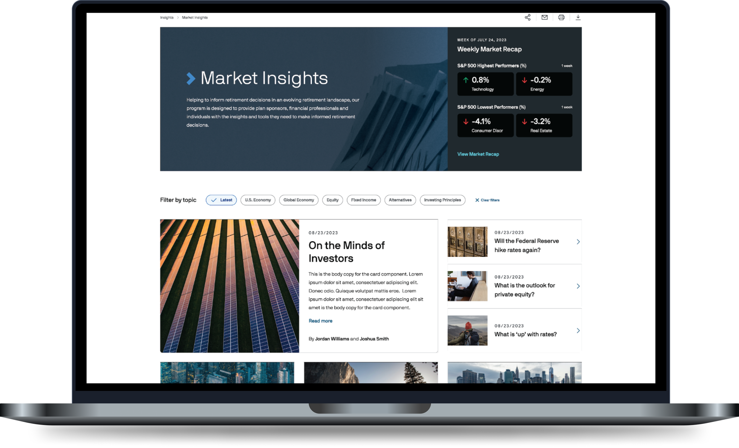
With the redesign of the Insights hub, I had to look at the content holistically and work with the team at J.P. Morgan Chase to create a hierarchy that was intuitive and offered the user with the top of mind content. The Weekly Market Recap was identified as an important piece to be highlighted. In the existing design, the Weekly Market Recap resided in an information banner as a download link.
The Content

As an important piece of the page, I began exploring alternatives to highlight the Weekly Market Recap more. I worked with the developers to assess the ability to pull in some of the information as a teaser to drawer the users’ attention and encourage further exploration. Some of the initial iterations, highlighted the Weekly Market Recap as a top article in the news section and displaying some key data points.

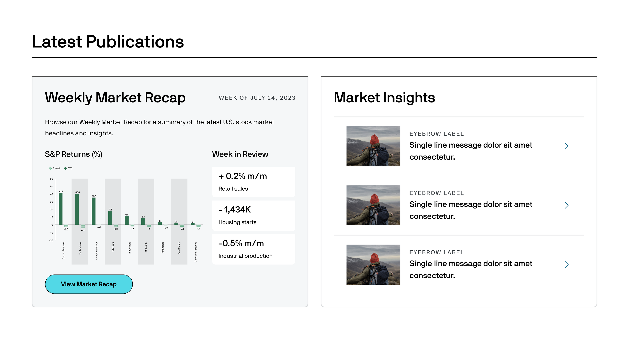
The stakeholders, loved these initial iterations but they wanted to bring more attention to this piece and helped provide the data they wanted to highlight. I worked with the developers to create a new component specifically for the Weekly Market Recap that placed it on the hero banner.


The Landing Page
Before
The existing landing page contained way too much information that was often not of importance to the users. Based on the analytics we examined, less than 5% of the users interacted with certain blocks. The page design was also antiquated and not up to par with J.P. Morgan Chase’s brand refresh.

After
The new design is more concise and offers the users an at-a-glance view. Since this is merely a landing page, the user is presented with the most important information, and they have the ability to explore further if they so choose. The user also has the ability to filter the information according to their interests.

The Detail Pages
Before
The individual insights pages were not cohesive. They all provided similar information in different ways and did not connect well with the landing page. The pages were also created as tabs (despite having different URLs) and there was no clear way to connect back to the landing page.

After
I created a template for the individual pages so they all aligned on the same look and feel. The hierarchy of information was also evaluated and the content was reorganized. A clear navigation structure was created using breadcrumbs to connect to the landing page with quick links to connect to the other sections as well.