Buoy
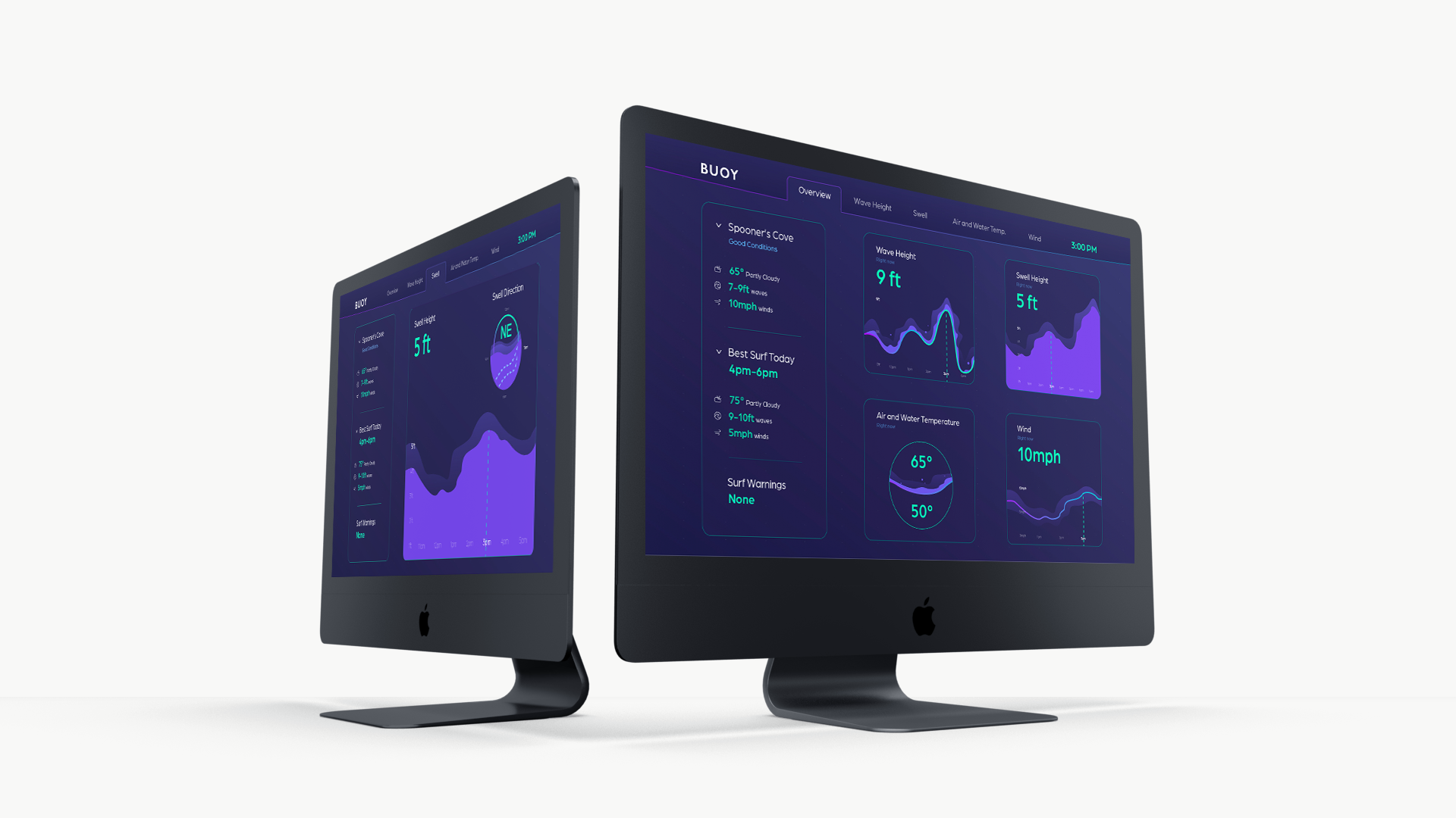
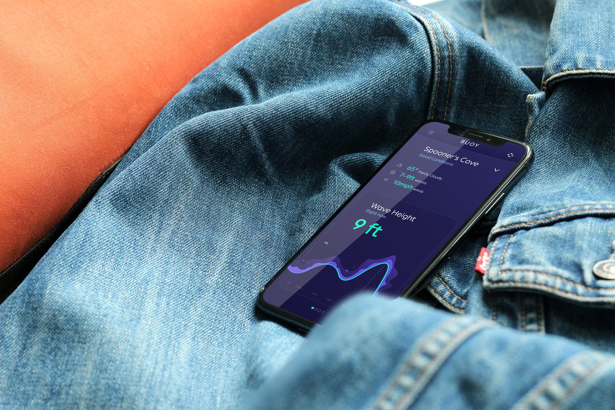
Creating a sleek and modern interface that is both intuitive and appealing to the surfing community as well as other outlier users was imperative. Since a variety of people would find use in this app, from pro surfers to beginners, the aim was to create a data visualization system that people can comprehend at a glance.
Goal
Designing a sleek brand and a straightforward forecasting app with self explanatory and easily comprehensible data.
Role
Brand Designer, User Experience and User Interface Designer
Tools
Adobe Illustrator, Adobe XD


I still like to start designing with the good ol’ pen and paper.
After an in-depth research, speaking with surfers, looking at apps and trying out the waves ourselves, I crafted a UX strategy, with these being the primary users:
A new surfer who needs an easily navigable application with simple language so that they can get to the information they need easily without having to learn surf language and terms.
A seasoned surfer who needs an app that warns them of extreme surf conditions and notifies them when their optimal surf conditions are present
An athlete/swimmer who needs a forecasting app with a quick view of the surf conditions so that they know the best and mellowest conditions to safely practice or go out for a swim
Once that was all figured out, I put some of my ideas down on paper.